
How Signage Impacts Customer Decision-Making: The Psychology Behind the Design
How Signage Impacts Customer Decision-Making: The Psychology Behind the Design
May 28, 2025
May 28, 2025

Why Business Signs Are One of the Most Powerful Marketing Tools
When it comes to attracting customers and influencing behavior, signage is one of the most powerful, yet least expensive, marketing tools a business has. While location, service, and product quality are essential, the sign makes the first impression. And first impressions, as they say, are everything.
So what exactly goes into a sign that works? Beyond craftsmanship and materials, it’s about psychology. Good signage doesn’t just look good — it communicates something deeper and prompts action. Here’s how.
1. Strategic Placement: Guide the Customer’s Journey
Where you place your sign affects its effectiveness. Eye-level signage tends to grab attention more easily, while poorly lit or obstructed signs might go unnoticed. Think about how people move through your space. Are they driving by, walking in, waiting in line, or do they have a totally different interaction with your brand? This data is actionable and should drive your decision-making.
Strategic placement considers both visibility and flow. A well-placed sign guides the customer’s journey seamlessly.

2. Color Psychology: Set the Mood and Motivate Action
Colors have emotional weight. They can energize, calm, warn, or invite. Red often conveys urgency, while blue suggests trust and reliability. Green tends to evoke calm or eco-consciousness, while yellow catches the eye with friendliness and optimism.
When used strategically, color not only attracts attention but also aligns with your brand’s personality, price point, value, and sets the customer’s expectations up front.
Want to read more about color theory in signage? Check out our other blog.
3. Keep It Simple: Why Clean Design Converts Better
The best signs are simple. Too much information can have the opposite effect and overwhelm customers, making them tune out entirely. Your sign should communicate one clear idea: what you do, who you are, and what action to take.
This is why negative space (the empty areas around and between design elements) is so valuable. It gives your message breathing room and helps it stand out.
Don’t be afraid of negative space, as it’s there to add clarity!
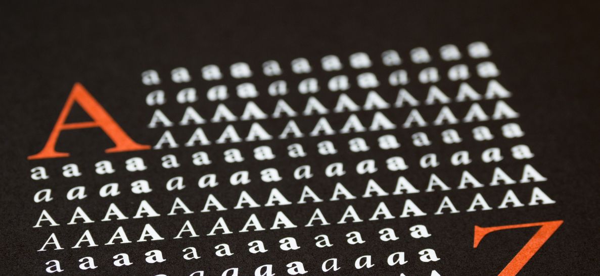
4. Fonts & Legibility: More Than Just Style
Believe it or not, typeface choices say just as much as the words themselves. A sleek sans-serif font can signal modernity and efficiency, while a serif font might communicate tradition and professionalism. Overly decorative fonts, if misused, can be hard to read and come across as unpolished.
Legibility is key, especially for signs, as they may be read quickly from a distance or by passing traffic. The right font keeps your message clear and consistent with the image you portray and the words you say and write.
5. Visual Consistency: Build Trust Through Unified Branding
When signage aligns with the rest of your brand’s look and feel, from business cards to your website, it creates a cohesive experience. This consistency builds trust. Disjointed visuals, on the other hand, can send mixed messages and reduce credibility.
Customers are more likely to remember and return to brands that feel reliable, and signage plays a big part in that impression.
Get Your Custom Sign Designed with Psychology and Quality in Mind
In short, signs are silent salespeople, who say a lot! When thoughtfully designed, they do more than decorate — they guide, inform, and convert. By applying key psychological principles in design, businesses can create signage that not only looks great but truly connects with their audience.
At Phillips Sign & Lighting, we understand that every detail matters — from font choice to installation height. Let us help you craft signage that turns heads and drives action.
At Phillips Sign & Lighting, we take pride in our team’s commitment to excellence, craftsmanship, and customer satisfaction. Together, we are dedicated to lighting up your brand and leaving a lasting impression.