How Your Branding and Signage Speaks to Customers
How Your Branding and Signage Speaks to Customers
October 8, 2024
October 8, 2024

Understanding Color Psychology for Effective Branding
Decades of research have explored color psychology—the idea that specific colors trigger reactions or associations in our brains. Understanding color psychology is a skill businesses and marketers use to convey messages without speaking directly to consumers. Some of the best examples of using color psychology to position effectively in the market come from the world’s biggest brands.
Let’s break down the psychology behind different colors so you can make informed decisions while designing your branding.
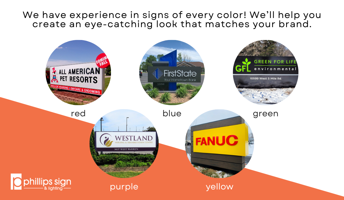
Red:
Red is one of the most visually striking colors. It portrays feelings of urgency, passion, and power. Research also shows that red can make the viewer feel hungry! So it makes sense that huge brands like McDonald’s and Coca-Cola make use of the color.
However, it’s important to consider possible negative connotations of the color. Red can be viewed as aggressive, dangerous, or jarring if used in the wrong context. It’s a color that has a lot to say, so make sure it aligns with your brand’s tone of voice before using it.
Green:
Green instantly reminds us of nature—think of grass, trees, and other living things. It’s associated with health, hope, and relaxation.
Whole Foods, for example, uses green to reinforce its image as one of the healthiest grocery stores in the USA.
Blue:
Blue evokes trust, strength, and stability. It’s often used by brands that want consumers to view them as knowledgeable in their subject area. Think banks, hospitals, or car manufacturers. Intel, a large tech corporation, uses blue in its branding to spark feelings of reliability.
Fun fact: Blue is the most popular favorite color worldwide! If you’re unsure which direction to take with your branding, adding blue is one of the safest choices.
Purple:
Historically, purple has been associated with royalty and luxury. Today, it’s often used to convey superiority or prestige. Since it’s used sparingly by brands, purple tends to stand out.
However, purple is also frequently associated with feminine energy, which is why brands like Hallmark—whose primary audience is female—use it heavily.
Yellow:
Yellow is an optimistic, happy color that evokes feelings of youthfulness and excitement. Think of sunshine and smiley faces. It’s bright and eye-catching, but be cautious: yellow can also induce anxiety. Police tape, traffic lights, and caution signs all use yellow as a warning signal.
Color Psychology in Signage
In today’s world, consumers are bombarded with branding from every angle—both online and offline. When designing your business signage, it’s crucial to understand how elements like color create an impression within seconds.
A study published in the journal Management Decision found that people form decisions within 90 seconds of their first impression of a product, and color alone contributes up to 90 percent of the information that drives those decisions!
At Phillips Sign and Lighting, we can help you create signage that matches your brand’s personality and helps you stand out from the crowd.
At Phillips Sign & Lighting, we take pride in our team’s commitment to excellence, craftsmanship, and customer satisfaction. Together, we are dedicated to lighting up your brand and leaving a lasting impression.