Take your brand to the next level in 2025
Take your brand to the next level in 2025
December 10, 2024
December 10, 2024

Branding Trends: How to Refresh Your Brand and Stand Out In 2025
As 2024 winds down, for many business owners, it’s natural to reflect on the year’s wins and misses. But why stop at reflection? The new year is the perfect opportunity for a ‘brand-new you’—literally. Refreshing your brand for 2025 can keep your business relevant, modern, and competitive. This guide explores the latest design trends and shows how to make them work for your unique brand identity.
We will break down some important elements of your branding, explain where the trends are heading, and give you some examples of brands that have successfully refreshed their look and feel with some simple tweaks and strategies.
Whether you plan to re-design your branding yourself or pass it off to a designer, you’ll know what to look for.
Color
Color is a cornerstone of branding. It communicates your brand’s personality and values at a glance. While it’s tempting to follow trendy colors, staying true to your brand identity is non-negotiable. That said, understanding what’s popular can help you make informed updates.

In 2024, blue reigned supreme as the most-used color among the top 100 global brands. From calm pastels to bold, vibrant hues, blue’s versatility makes it a perennial favorite. A local example is General Motors, whose 2021 logo redesign modernized its brand to reflect a commitment to electric vehicles. Their bold, dynamic blue communicates innovation and progress and was ahead of the trends at the time of its adoption.
Beyond blue, boldness is the theme across the color spectrum. Vibrant color combinations are becoming increasingly popular, adding energy and uniqueness to branding.
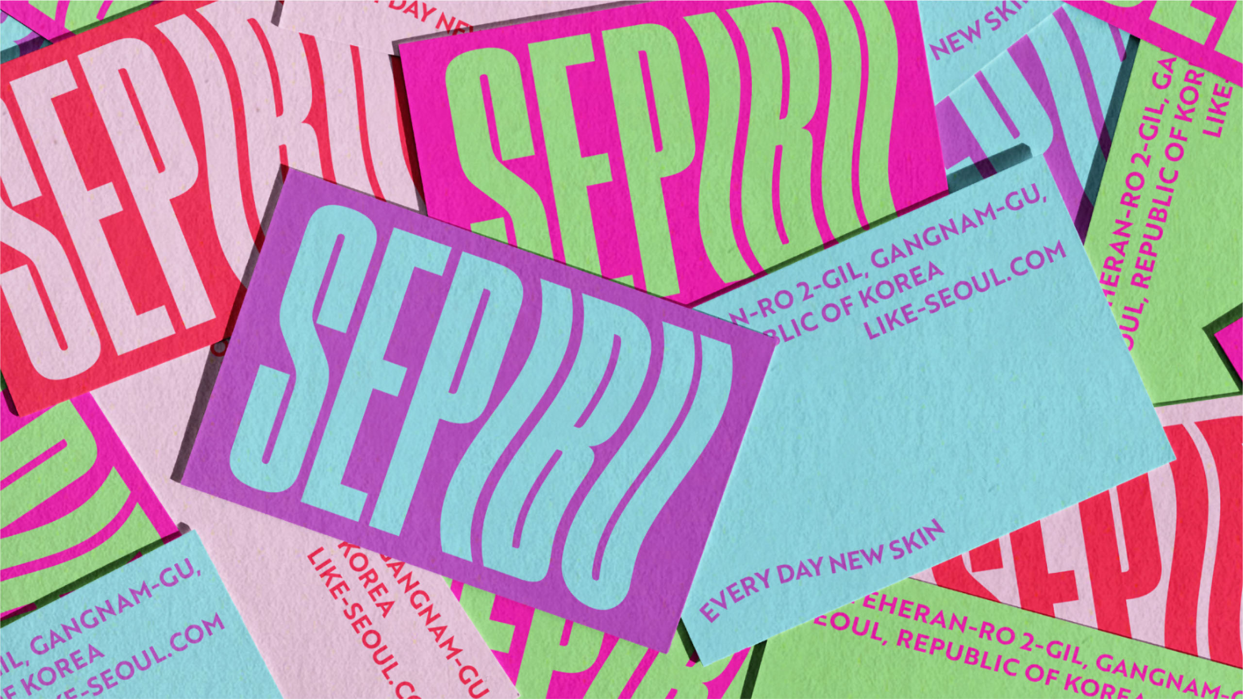
Source: https://www.behance.net/gallery/195817761/SEPIBU-?tracking_source=project_owner_other_projects
Fonts
Custom/Unique Fonts
In recent years, designers have been pushing the limits of creativity with font choices. Fonts have become a vital part of a brand identity and another way to stand out from the crowd. One of the biggest trends right now is custom fonts. Custom fonts offer a distinctive touch, but if creating one isn’t feasible, finding a unique typeface can have a similar impact. Choose something memorable that aligns with your brand’s tone.


Hand-Written Fonts
As a counterbalance to AI and digital minimalism, handwritten fonts evoke warmth, imperfection, and humanity. These fonts can make your brand feel approachable and authentic.

Source: https://www.fontspring.com/fonts/tugcu-design-co/brink
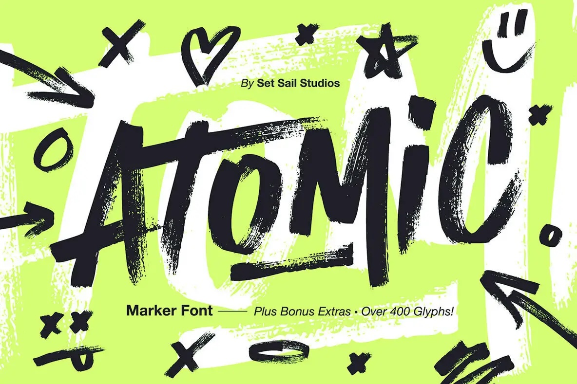
Source: https://www.youworkforthem.com/font/T16369/atomic-marker?aff=762
Bold Fonts
Thick, chunky, sans-serif fonts remain a go-to choice for their versatility and impact. They work well across digital platforms, print materials, and social media, and every brand should have at least one sans-serif option in its toolkit.

Source: https://tropicaltype.com/products/big-sexy-sans

Elements
Small design details can make a big impact. Here are a few trends to integrate into your branding elements:
Hand drawn illustrations
Companies are moving away from the 3D “corporate” illustration style that has prevailed for the past few years and to a more human, individualistic illustration approach. There are styles for every kind of brand, and illustrations are great assets to add to your digital and print media to help it stick out.

Source: https://yashprajapati.work/portfolio-1/project-four-6fm48-99ywj-ht9hp-4x895-kxwkm-nt97e
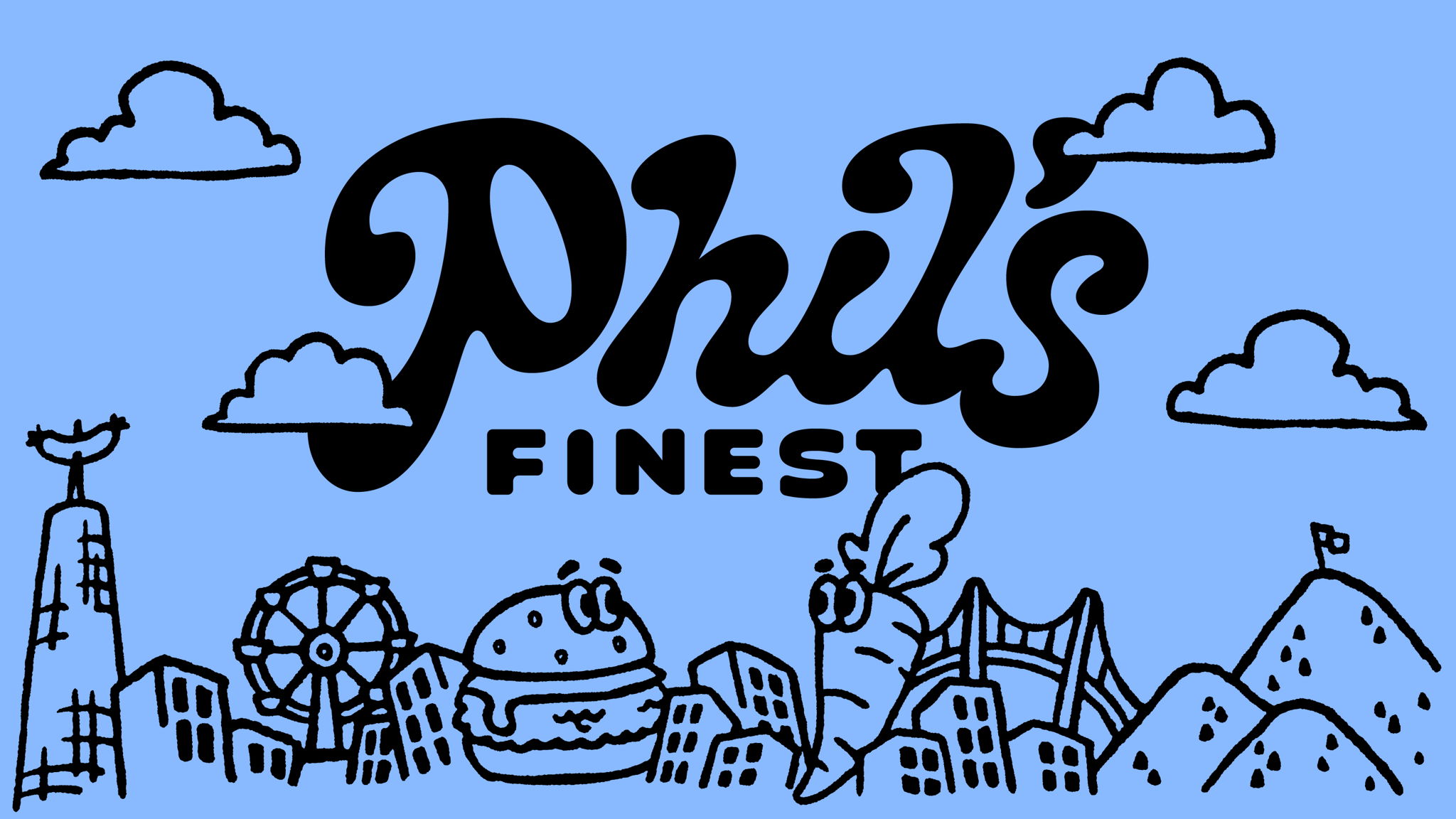
Source:https://bpando.org/2023/11/21/phils-finest-by-gander/
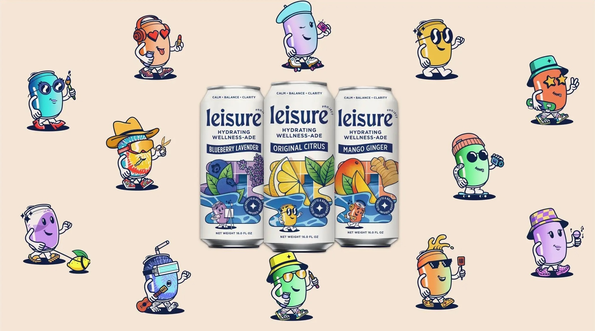
Source:https://thedieline.com/leisure-project-is-the-first-web3-functional-beverage-designed-for-content-creators/
Interesting Photography Frames
Custom frames around images—whether playful, artistic, or brand-specific—enhance visual interest and tie photos to your brand’s identity.
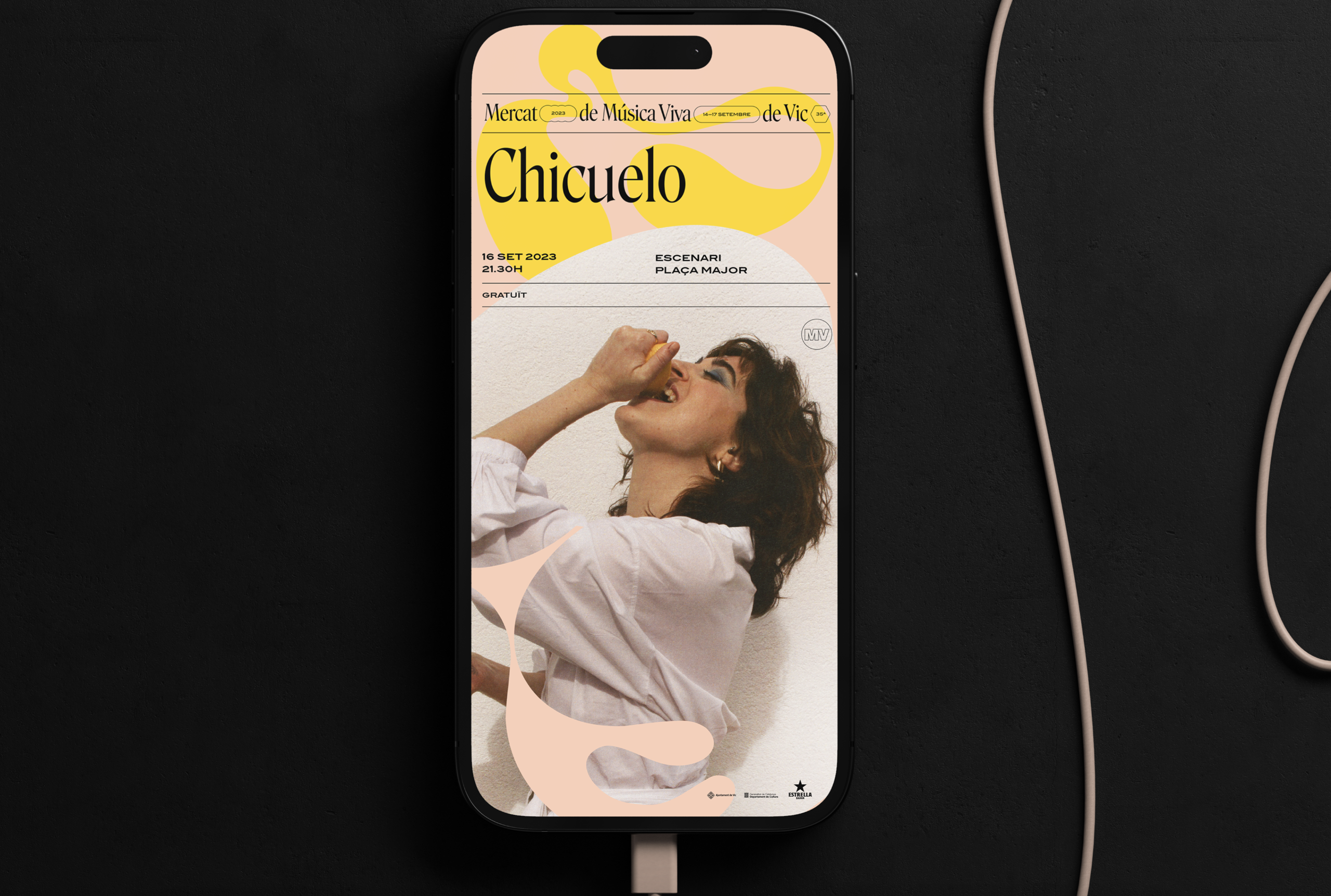
Source: https://www.behance.net/gallery/201842853/Festival-Branding-MV23?tracking_source=search_projects%7Cretro+font+branding&l=236
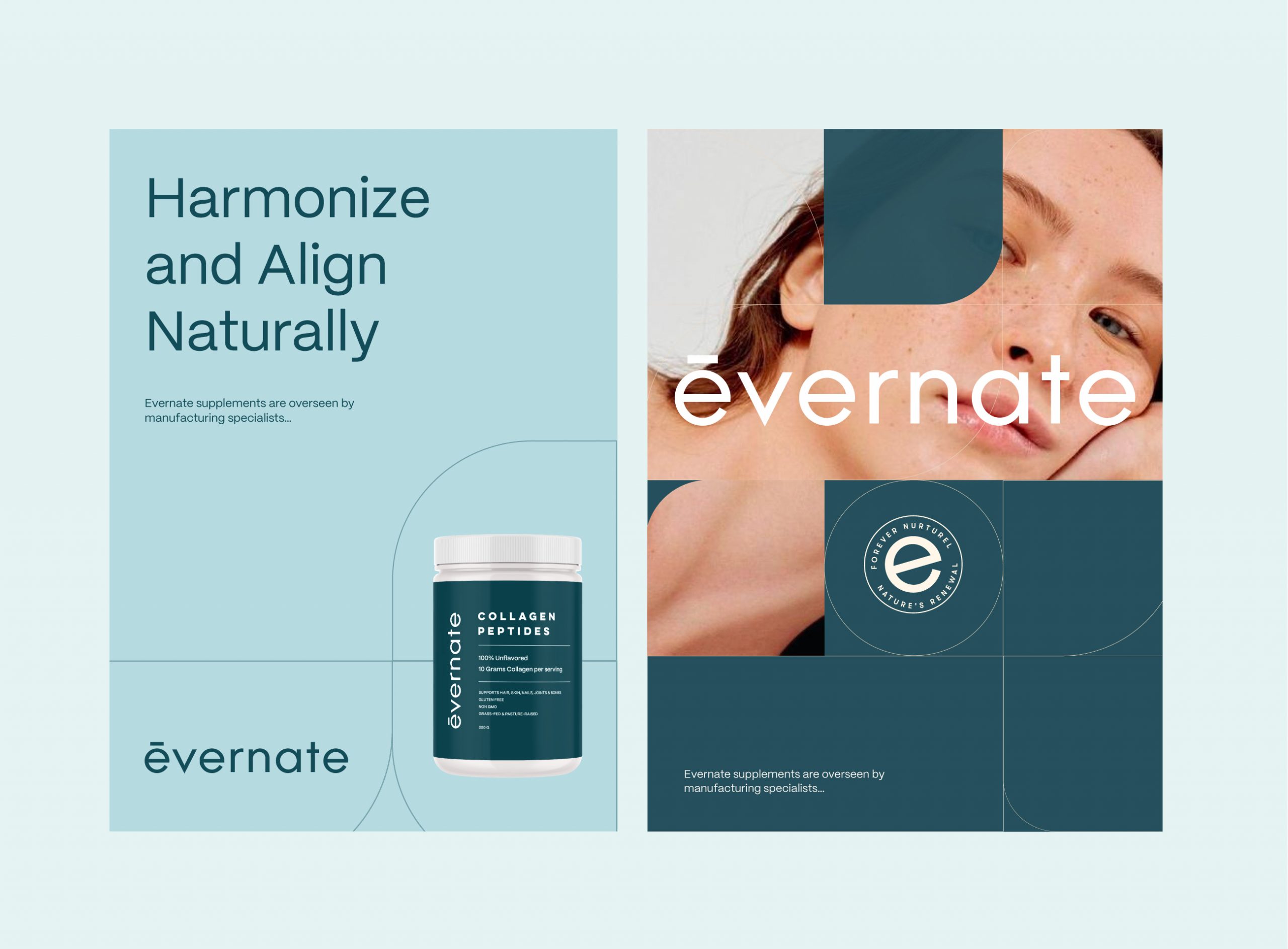
Source: https://www.behance.net/gallery/201588373/Evernate?tracking_source=search_projects&l=9
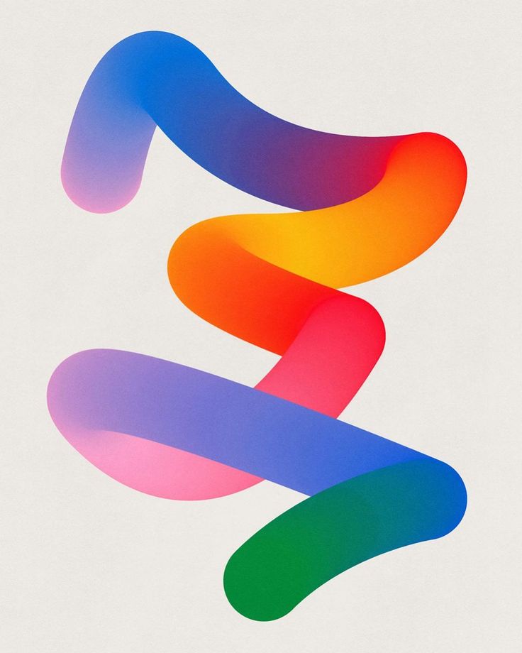
Gradients
Gradients have been big in branding for quite a few years now, but they’ve come a long way from the gradients used back in the late 2010s. Gradients are evolving, with deeper tones and textures replacing flat designs. Adding gradients to your branding can bring depth and vibrancy, especially on digital platforms.
Source:https://www.behance.net/gallery/125691505/Printmaking-Challenge-V10

Size
Experimenting with the size of branding elements can distinguish your brand. Oversized logos and design elements create bold statements, while tiny, purposeful details can draw attention and create contrast. Play with scale to see what resonates with your brand’s personality and audience.
Here is an example of using an oversized version of your logo as a design asset
Source: https://truffl.com/work/beauty-dose
Or using the oversized logo as a photo frame.
Source: https://truffl.com/work/beauty-dose
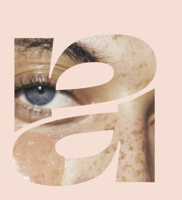
But playing with sizing doesn’t always have to mean going big, it could also mean going purposefully tiny or leaving lots of white space. Contrast creates focus, so having something small that sticks out can be just as effective.
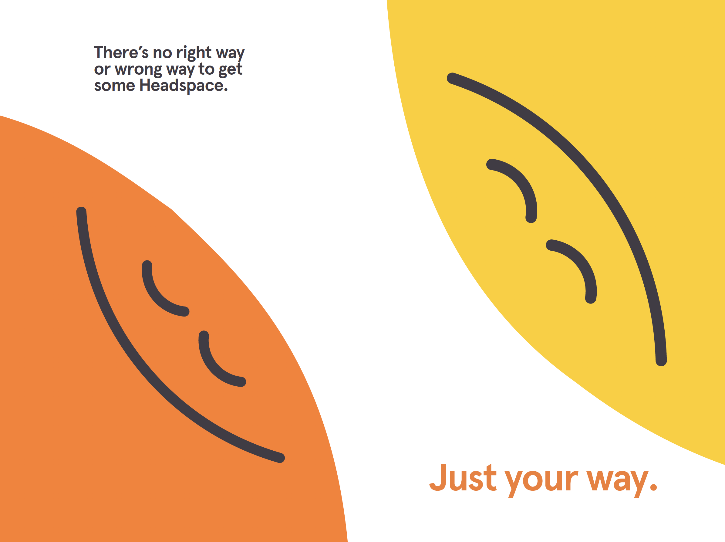
Source: https://paddyfraser.com/Headspace
Texture
In a world of clean, minimalist designs, texture is making a comeback. Adding subtle grain or retro-inspired textures can ground your brand in a tactile reality, creating a memorable aesthetic that sets you apart.
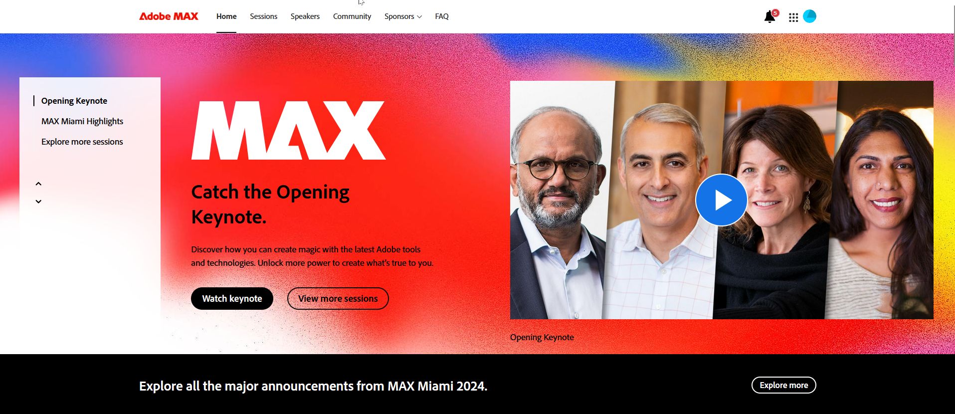
Source: https://www.adobe.com/max.html
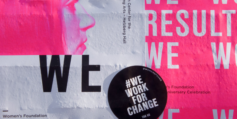
Source: https://www.behance.net/gallery/66098231/Womens-Foundation-25th-Anniversary-Campaign?tracking_source=search_projects_recommended%7Canniversary
Key Takeaways:
- Bold is big. From thick fonts to oversized assets to new color pairings, don’t be afraid to think outside of the box with your brand design. Sticking out is important.
- In direct contrast to the rise of AI and hyper-clean minimalism, your brand feeling human is important. Hand-made fonts and illustrations, or interesting textures can ground your brand in reality and keep it from fading into the background online.
- Strive to have a deep asset library so you can create branded content for all of your target audiences that stays on brand while also speaking to different audiences and what catches their attention. Gradients, photography frames, contrasting fonts, and different logo sizes are great ways to do this
- While adapting to the times and what will stand out is very important, nothing is more important than staying true to your brand and tone. A hyper professional bank might not do well with incorporating a new funky and retro font, but a local tailor or plumbing company might. Stay true to the lifeblood of your brand while pushing it into the future.
Ready to start your first business project of the new year?
Contact Phillips Sign and Lighting today for a quote on a new sign to help your business stand out.
Don’t miss out on our latest post!
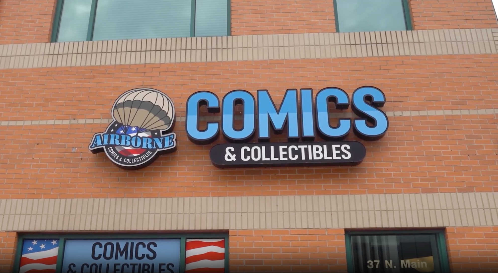
Client Spotlight: Airborne Comics & Collectibles
Taking Flight in Mount Clemens Airborne Comics & Collectibles has officially landed in Mount Clemens. With the opening came a need for signage, and co-owner John Walus knew[...]
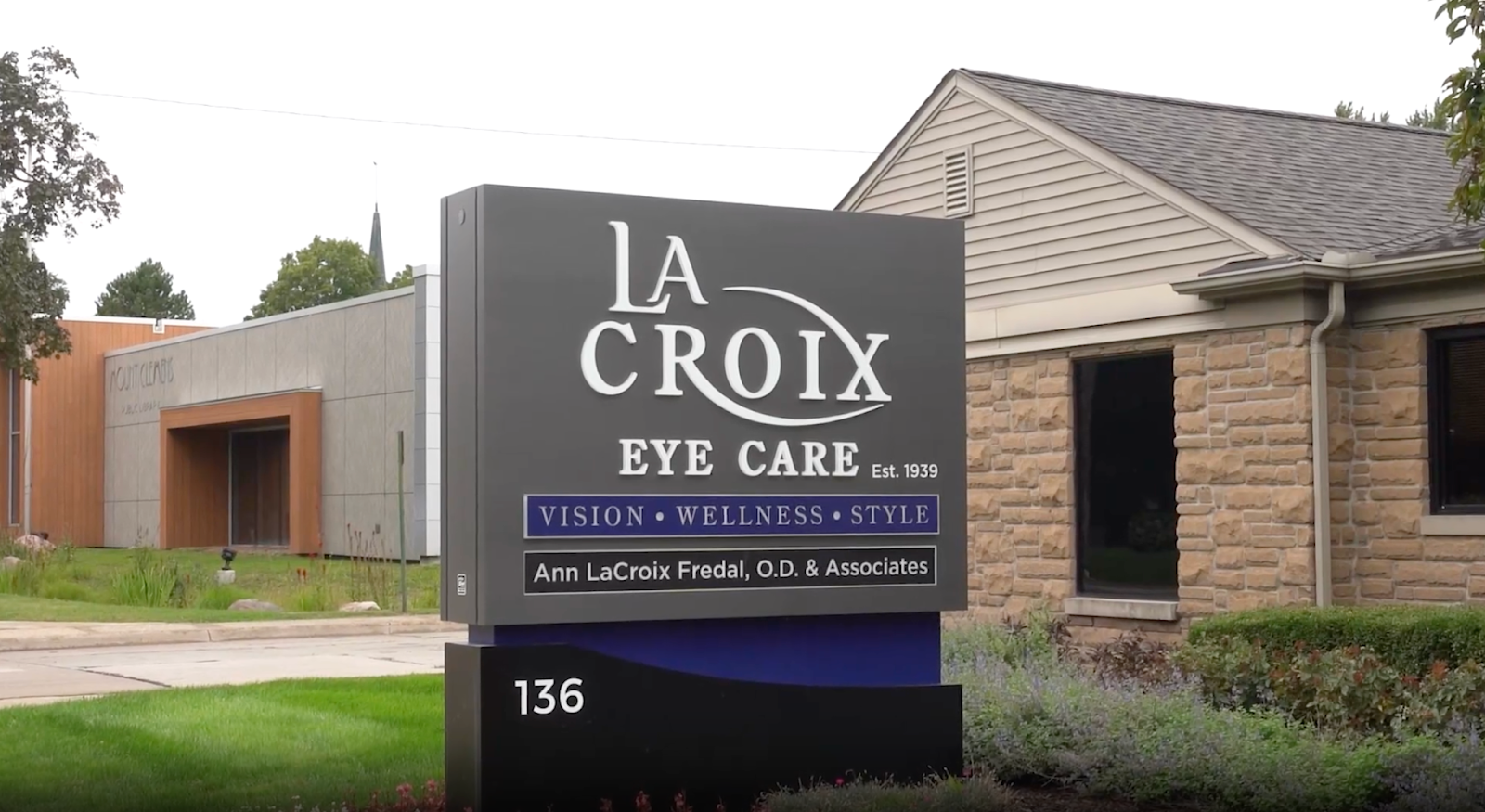
LaCroix Eye Care Gets A New Monument Sign
A Trusted Community Practice Gets a New Look This month, we are shining a light on LaCroix Eye Care, a long-standing optometry practice serving Mount Clemens since 1939.[...]
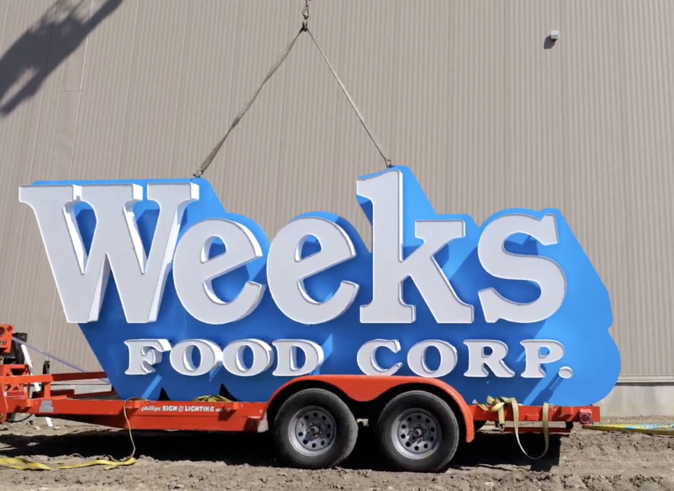
Weeks Food Corp. Expands: New Sign Highlights 100+ Years of Growth
Client Spotlight: Weeks Food Corp. A Century of Growth Gets A Brand New Look This month, we are shining a spotlight on Weeks Food Corp., a family-owned business[...]
At Phillips Sign & Lighting, we take pride in our team’s commitment to excellence, craftsmanship, and customer satisfaction. Together, we are dedicated to lighting up your brand and leaving a lasting impression.